pav interaction presents · Oddfolk UI
A little wonder.
In every window.
Warm gold, quiet mist, deep dusk. Give your game’s menus the same atmosphere as the world beyond them.
Native Unity UI Toolkit Desktop game interfaces
03Distinct themes
06Included languages
AaUnderdog + Golos Text
UIEditable Unity source
01 / The look
One world.
Three moods.
A shared visual language for the everyday moments of play. Textured frames, illustrated backgrounds and consistent controls — with a palette for each kind of story.
Amber accents and dark plum surfaces. Golden highlights keep actions visible without stealing the scene.
Real Unity Player captures.
Open any image for a closer look.
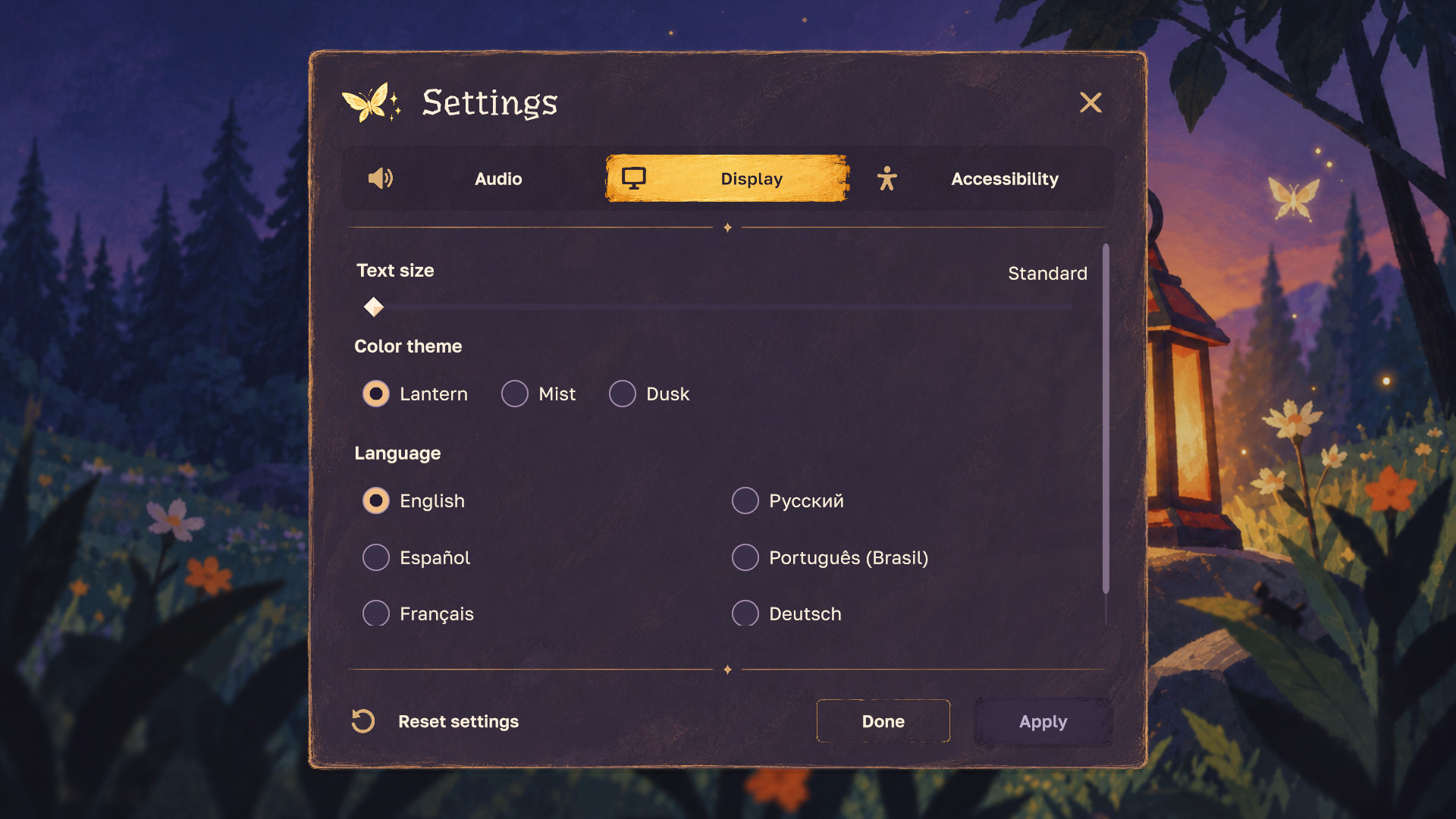
Three text sizes, High Contrast and Reduced Motion are part of the same system. Your appearance profile can change palette roles, fonts, backgrounds and sound references.
02 / The flow
Small interactions.
Thought through.
Preview a change. Keep what works. Settings stay open when applied, and the confirmation appears in the upper-right corner without moving the window.
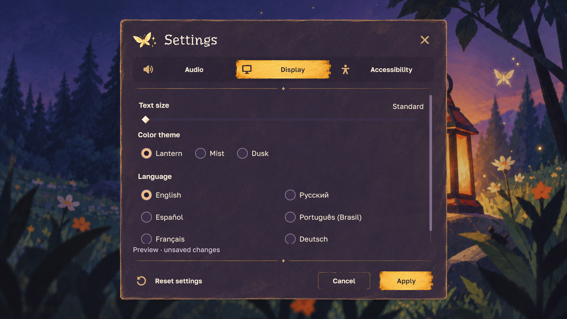
Scrollbars overlay the page; content keeps its width.
Success, warning and error use text, icons and color.
Pointer hover and keyboard focus have distinct states.
Explore actual Unity screenshots. The preview tabs show each stage of the settings flow.
See the sequence.
From the title menu to settings, Apply and pause. An edited sequence of native Unity screenshots in the Lantern theme; silent, with captions.
Read the sequence
- Main menu in Lantern.
- Audio settings in Lantern.
- Display settings in Lantern.
- Preview Lantern with Apply enabled.
- Apply saves in place; a success toast appears.
- Apply is disabled until another change.
- Pause menu.
- Return-to-title confirmation.
- Main menu in Lantern.
03 / Inside the kit
The familiar essentials.
A few paths beyond.
Start with the main menu, pause, settings and HUD. Explore reusable controls and optional illustrated examples when your game needs more.
Examples use demonstration data. Your game owns saving, inventory, progression, loading and purchases; the UI exposes requests and displays adapter-confirmed results.
One kit.
Different game worlds.
Two fictional games, built from the same Oddfolk controls. Each has its own generated background and emblem, native title text, palette, frames and dividers. These are real Unity captures from saved example scenes. The three player themes remain available inside each game.
Moss & Copper
A forgotten botanical world · mint accents · textured brush frame
Moonwake
A lunar observatory · lilac accents · fine double frame
Original lantern artwork remains included.
Build on a shared system
Buttons, tabs, sliders, toggles, input fields, dropdowns, progress indicators, tooltips, confirmations and notices. Common tokens tie their surfaces, type and states together.
Make the look your own
Create an appearance profile outside the kit. Adjust palette roles, replace the title, emblem, backgrounds or font roles, then build the profile stylesheet. Keep your custom scenes and profiles separate for easier updates.
A companion for your agent
Optional instructions, API notes and a starter template help a coding agent reuse the kit. Journal, shop and confirmation examples demonstrate adapters. No AI service or agent subscription is included.
Room for more stories
Hello.
Привет. Olá.
Six local text catalogs are included, using the bundled Underdog and Golos Text families. Override strings in your own project and check your game’s longest lines.
- English EN
- Русский RU
- Español ES
- Português do Brasil PT-BR
- Français FR
- Deutsch DE
Six Latin and Cyrillic language catalogs, with fonts included. Check your own strings and longest translations when adapting the kit.
04 / Before you build
Know what’s
in your hands.
Clear scope, editable source and a straightforward starting point. Here is the scope of the upcoming release.
- Framework
- Unity UI Toolkit
C# · UXML · USS - Verified environment
- Windows · Unity 6000.5.8f1
URP 17.5 · D3D12 - Presentation
- 3 themes · 3 text sizes
High Contrast · Reduced Motion - Typography
- Underdog + Golos Text
Included with SIL OFL notices - Sound
- Optional, replaceable UI cues
10 synthesized cues · no external sound library - Publisher
- pav interaction
Help with Oddfolk UI ↗
What does customization look like?
Start Here / Setup opens the examples and helps create an editable scene copy, personal appearance profile and sound palette. Change visual roles in the profile and rebuild its local stylesheet. Your changes stay outside the vendor folder.
Game title, header/menu emblem, backgrounds, panel tint and window frames are configurable. Choose the original frame, a tinted brush, a double line, no frame, or your own transparent texture. Frame and divider colors are separate per theme. Dividers support the theme default, brush, line, hidden or custom texture. Mist uses violet decoration, including its bundled moth emblem. Frame body insets match the surface to transparent frame art; spacing stays unchanged.
Is this a complete game framework?
No. It is a UI kit with integration examples. Game saves, loading, inventory, progression, pause ownership and payment processing belong to your game. Shop examples contain local demo data and no real purchases.
How does the glass effect work?
The illustrated glass uses the supplied background image and Unity’s native style filter. It does not capture or blur your camera output or unrelated 3D content.
Which platforms are supported?
Current validation covers Windows with Unity 6000.5.8f1, URP 17.5 and D3D12. Compatibility with other Unity versions, render pipelines, mobile, consoles, macOS and WebGL has not been established by this release candidate.
How was the artwork made?
The kit includes artwork generated with OpenAI image generation, prepared for use in Unity. The separate atmospheric illustration on this page is marketing artwork; images labeled “Native Unity capture” are actual renders of the kit.
The font families retain their SIL Open Font License notices: Underdog and Golos Text. Applicable product terms will be those supplied by the chosen storefront.
Can I buy Oddfolk UI yet?
Not yet. Oddfolk UI has been submitted for Unity Asset Store review. Publication will follow approval and final release preparation. This site previews the kit and its example scenes. There is no checkout or published product listing at this stage.
For product questions or release information, contact pav interaction.

From pav interaction
A little character.
A lot of care.
We make illustrated interfaces and reusable components for Unity games. Oddfolk is our first kit: a place for atmospheric artwork, familiar interactions, and details that belong together.
Meet us in your inboxThe next little adventure
Made for a world
you haven’t built yet.
Oddfolk UI is in the Unity Asset Store review queue.
Questions, feedback, or a game in mind? We’d like to hear from you.
Planned for the Unity Asset Store. A product listing and purchase link will appear here when available.